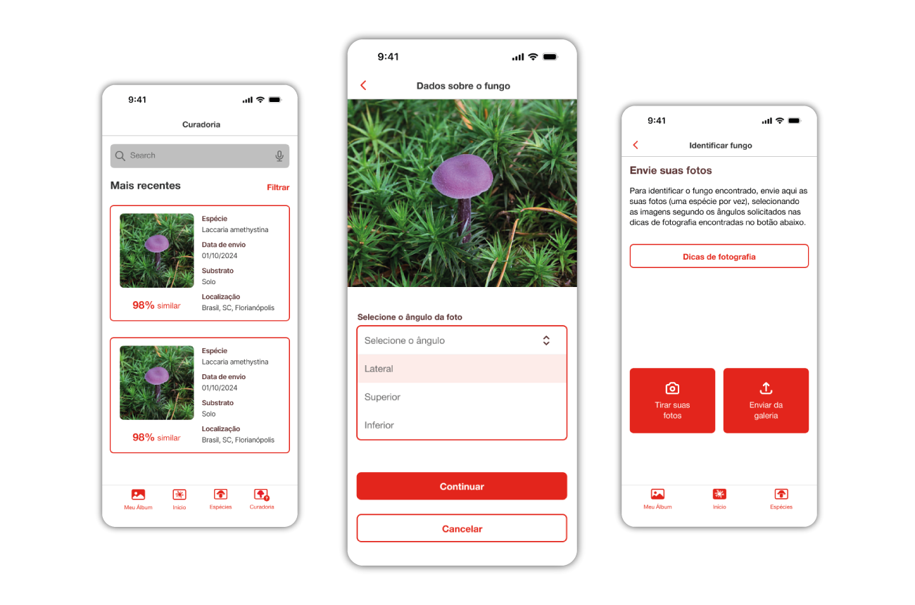
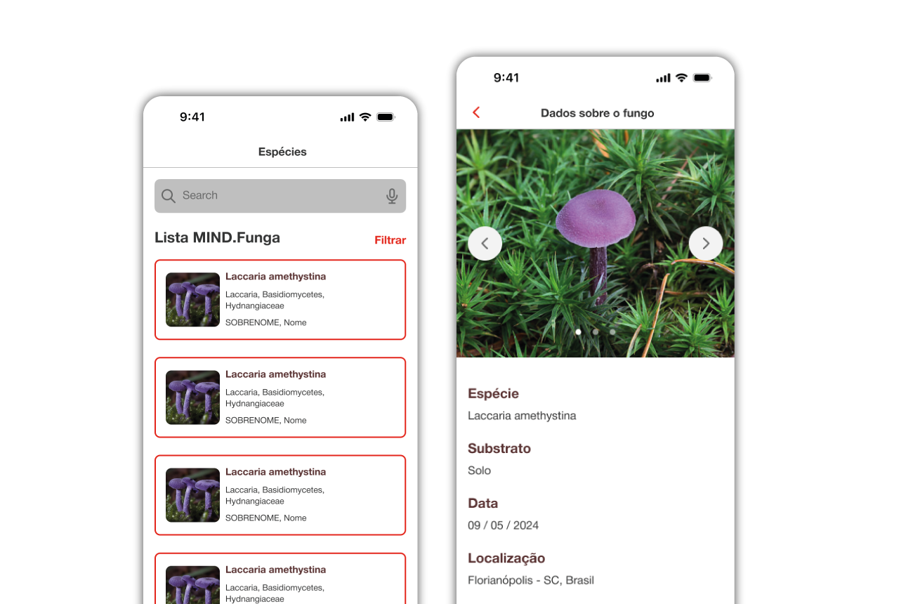
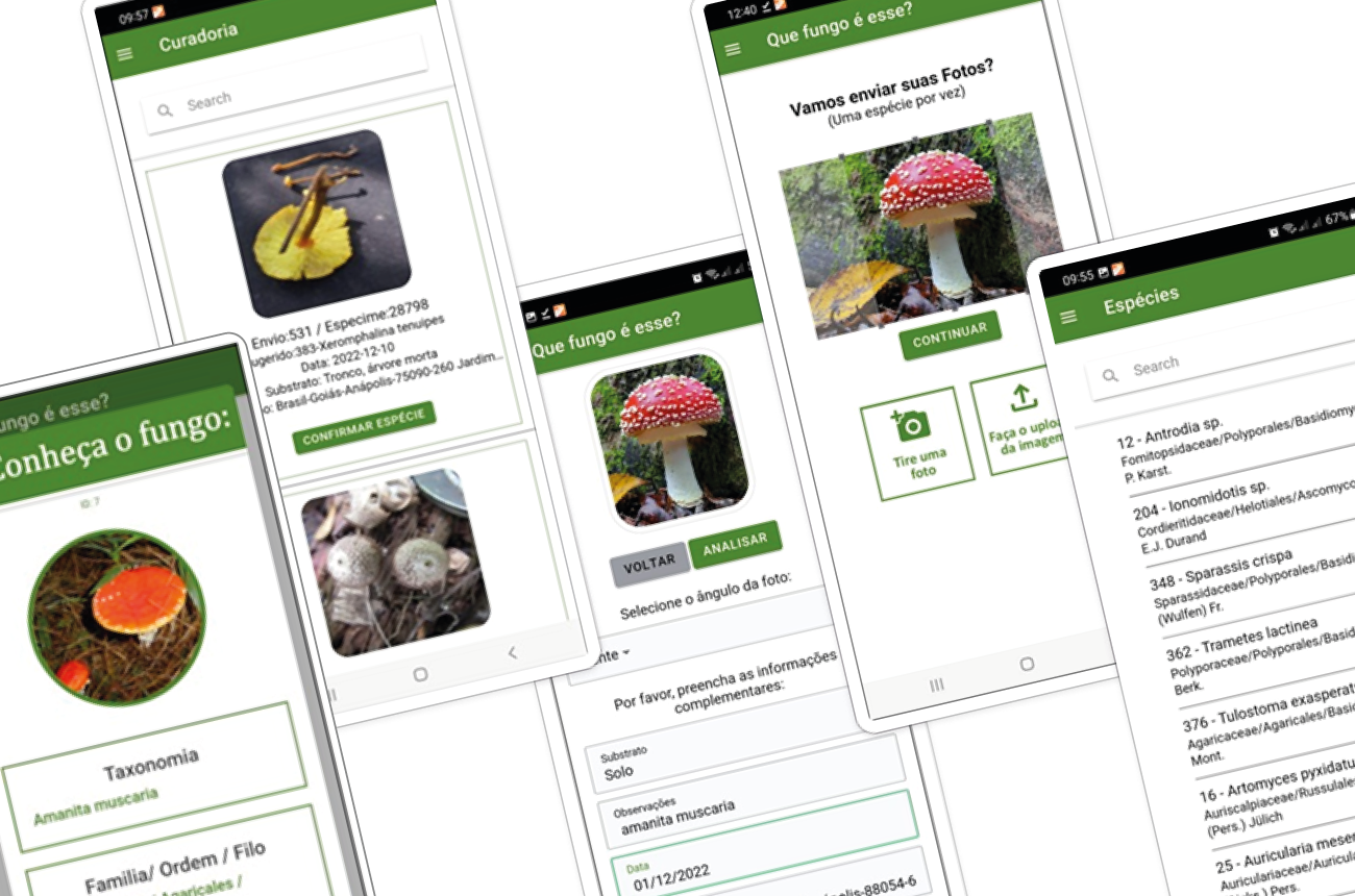
MIND Funga was created by research groups from several federal universities as an AI-powered tool for fungi identification. After its initial phase as a functional MVP, I worked alongside another designer to lead the UI/UX redesign. Our goal was to transform the developer-built screens into a more intuitive experience, ensuring both aesthetic harmony and improved usability.
MIND Funga
Context
My contributions
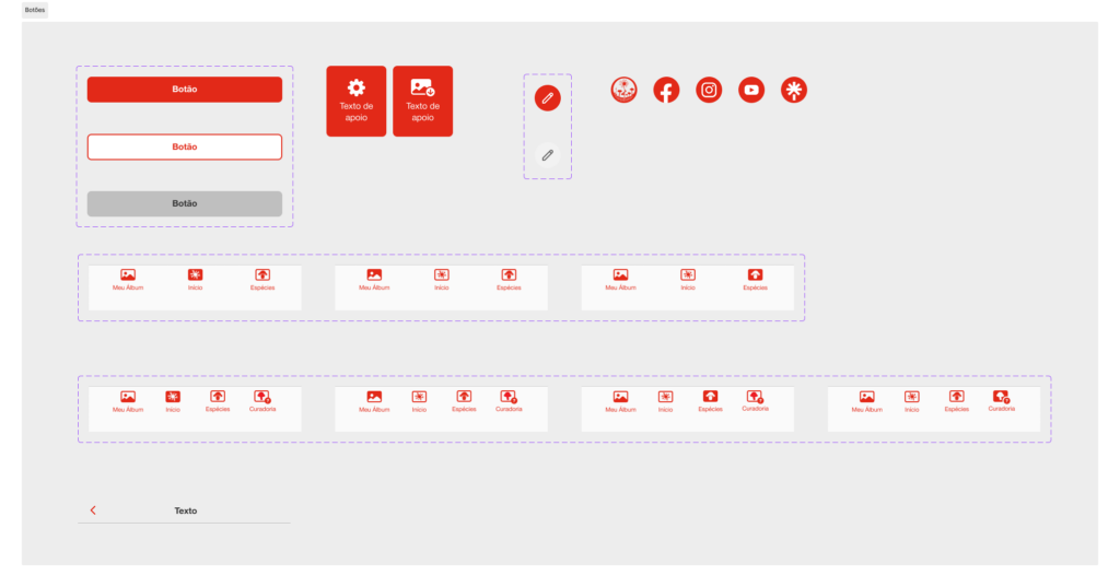
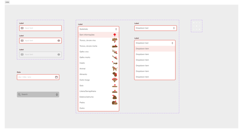
Working collaboratively, the other designer and I shared responsibilities across the entire project lifecycle. Together, we redesigned the user interfaces, established a comprehensive style guide with a component library, and conducted usability testing prior to the final developer handoff.
Challenge
With a tight deadline and visual-only brief, initial user research was not part of the project’s requirements. Nevertheless, we managed to conduct usability testing to validate if users could successfully navigate the core journey. While the results highlighted areas for further improvement, our execution remained focused on the specific deliverables and screen count defined in the contract.
Process
- Market Research: Analyzed similar apps to define a competitive visual direction.
- Inclusive Design: Studied and applied accessible color sets to ensure the app is usable for everyone.
- Component Library: Created a new style guide featuring hand-drawn icons specifically tailored for fungi cataloging.
- User Interface Redesign: Developed new layouts for all main application flows.
- User Testing: Validated the design with 42 users using Maze. Identified and resolved critical issues regarding navigation and icon metaphors.
- Data-Informed Improvements: Refined the interface based on user feedback and task completion rates.
- Technical Handoff: Coordinated with the development team to guarantee the integrity of the final product.
Stakeholder involvement
As the project was primarily stakeholder-driven, the scope for UX optimization was limited. Nevertheless, we remained dedicated to user advocacy, successfully implementing incremental improvements that aligned the client’s vision with better usability standards.
Lessons learned
While our role was primarily focused on visual delivery, we consistently advocated for the user by applying foundational principles of Information Design. We integrated functional, aesthetic, and cognitive layers (Pettersson, 2007) while addressing key elements of the user experience – specifically surface and structure (Garrett, 2011). This theoretical grounding ensured our visual choices were never merely decorative, but deeply rooted in clarity and usability.
Original version