Context
For this project, I’ve been hired to create the UI for my developer colleague Lucas Queiroz’s portfolio.
As this project is just a simple portfolio to showcase his projects, we’ve searched a lot of references on internet.
The structure was meant to be simple, clean, modern and most importantly: to be in a dark mode.
Requirements
The budget is low, so as we discussed the sitemap, we decided to create 4 simple pages:
Home – to showcase the projects and tools he masters.
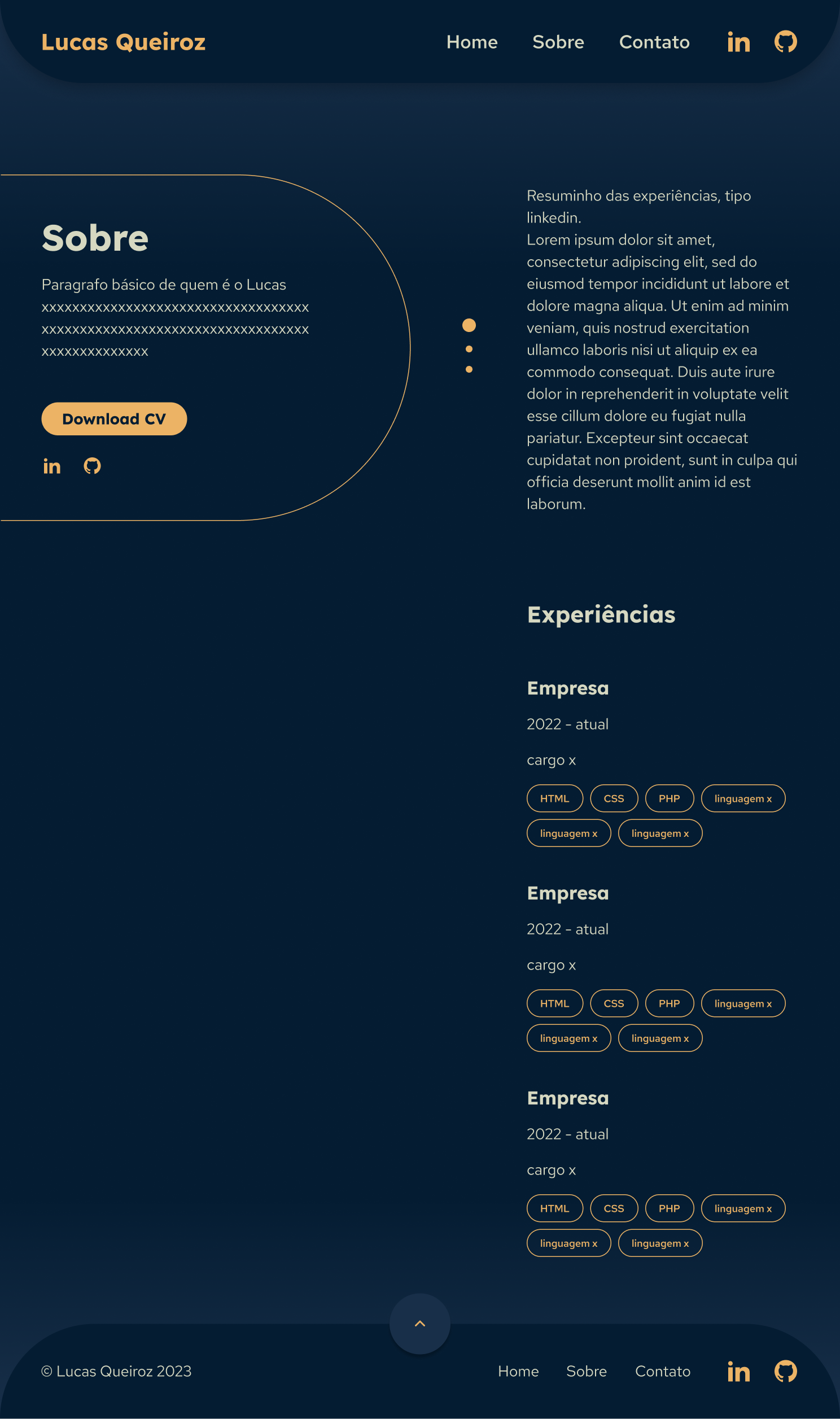
About – to allow the CV download, explain a little about himself and his experiences and redirect the viewers to his Github and LikedIn pages.
Contact – to showcase the e-mail and social media for people to get in touch with him.
Project page – a basic structure he can adapt at will when explaining this projects.
I have developed the following screen sizes, according to his request:
1200 px, 992 px, 768 px, 576 px and 320 px.
Process
- Benchmark research
- Analyze user’s journey’s on competitors websites and heuristics
- Structure the information architecture
- Wireframes on paper
- Style guide development
- Prototype and screens
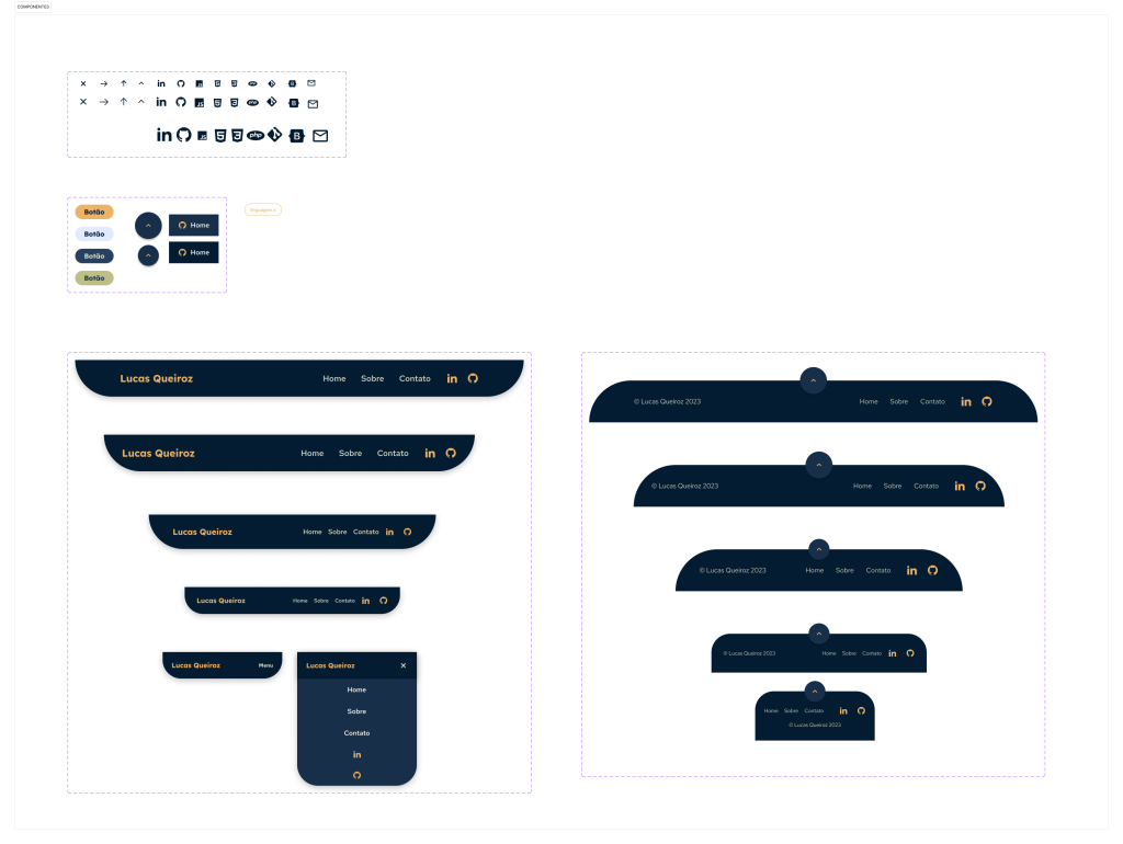
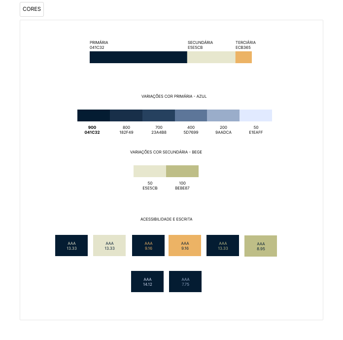
Styleguide
I started then developing some elements, such as colors, fonts and some icons, the rest I developed when building the pages and seeing what was best according to each screen size. Now it looks like this:
Design principles
- Develop a consistent style guide to provide a pattern to bring harmony and unity of the page
- Focus on CTA’s
Heuristics
- Keep only necessary information
- Visibility of the system status during the page scrolling
- Consistency through patterns, colors and icons
- Minimalistic design
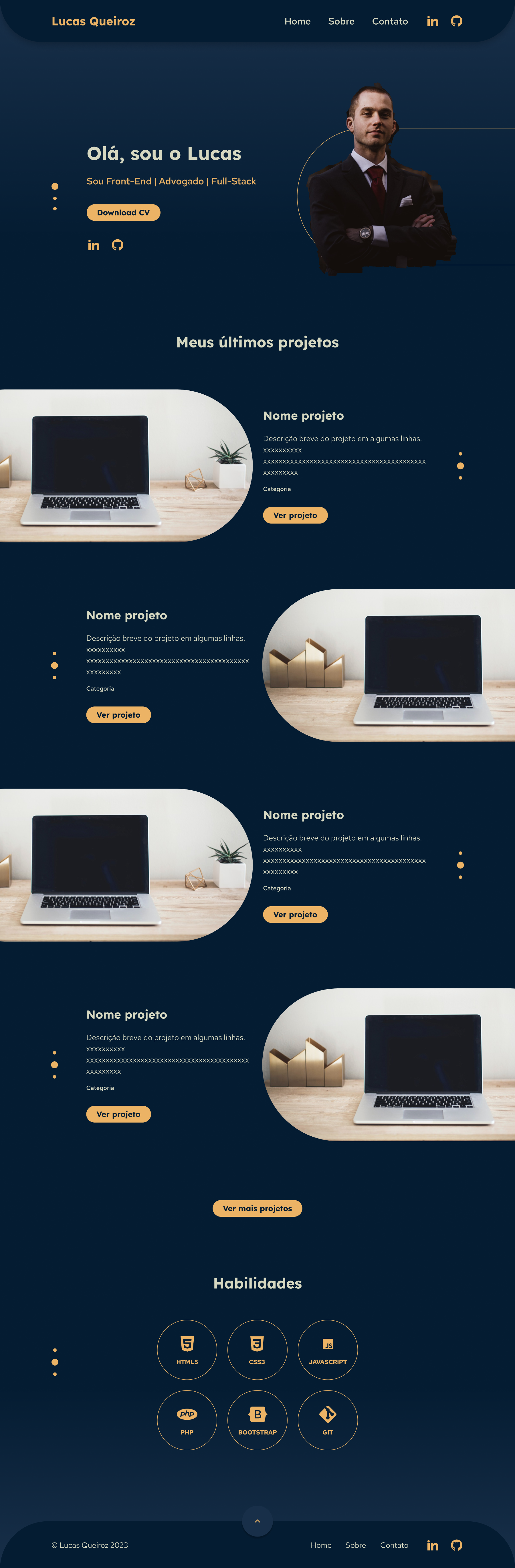
Final Interface
My interfaces are only an “almost” high fidelity mockup, since I didn’t have the texts or the pictures. I just got some from the internet to illustrate.
But the final result, the website online, will soon be available.