Trademark website

Context

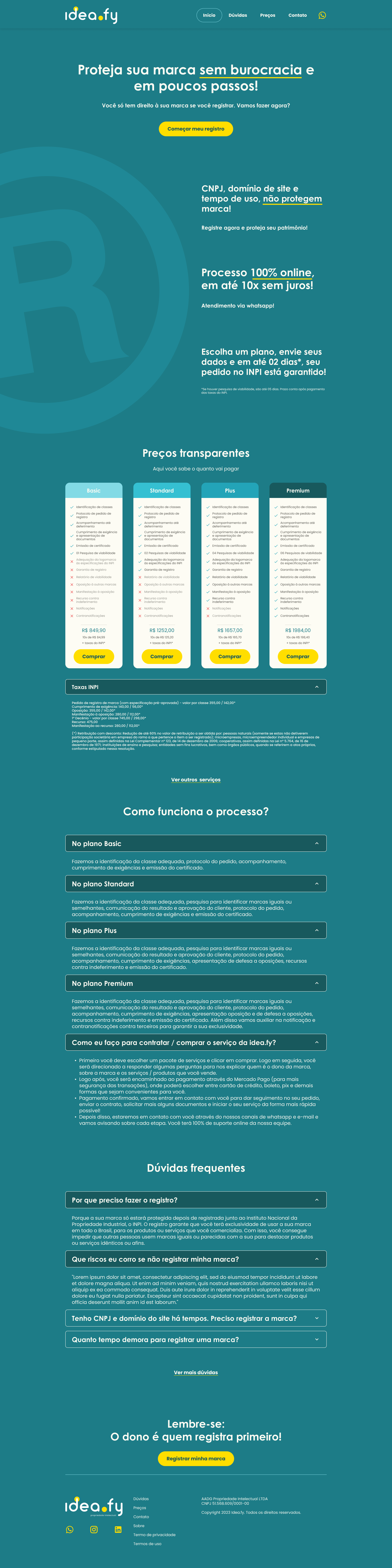
For this freelance job, I had to develop a website for a trademark small business in Brazil.

Their wish was to work exclusively online and sell the services through this webpage aiming small young entrepreneurs which are a great number in Brazil.

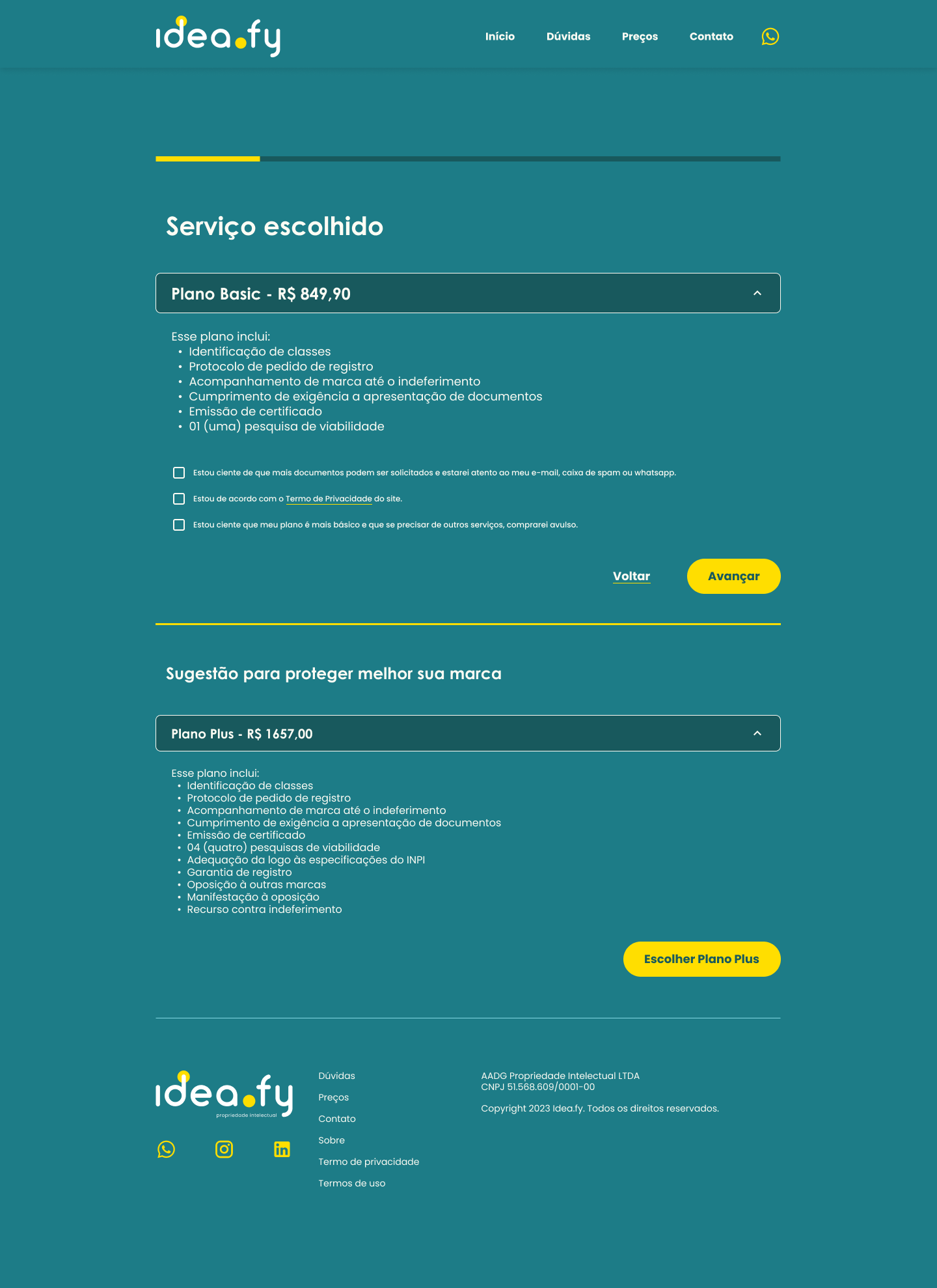
They already had done some market research and had worked with trademarks for quite a long time. I also had been through a process to register a brand when I was an entrepreneur, so I knew how to help them showcase their services in a simpler way and with a plain language (not full of juristic terms that no one besides a lawyer would understand).

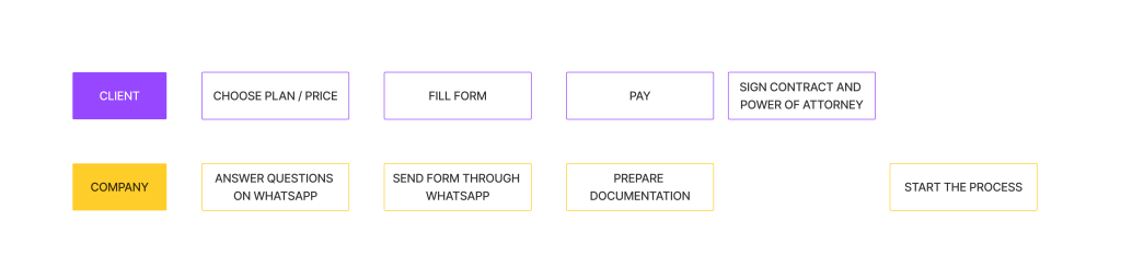
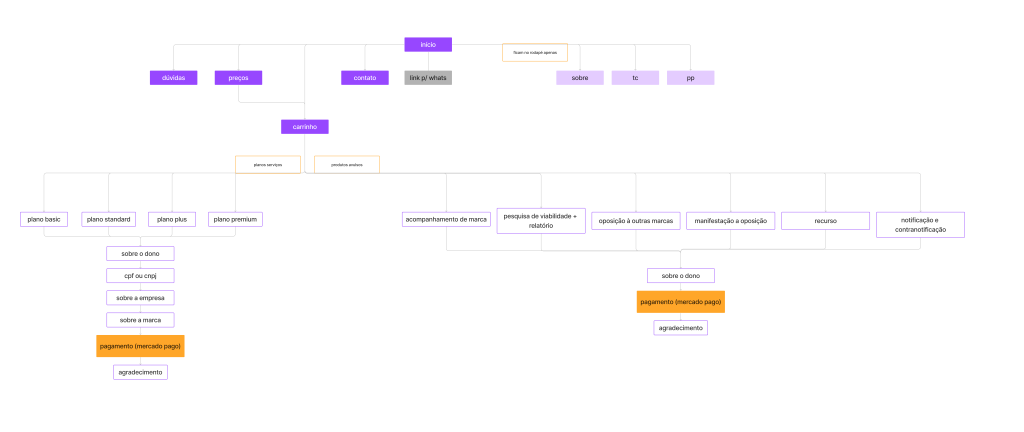
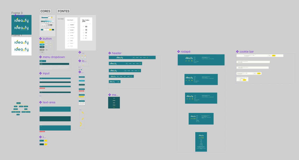
In my role, I was responsible for the research phase, developing the user journey, and creating the UI design and handoff documentation for the development team.

Requirements

  • The budget is low, they just started the business, so something simple and effective was necessary;
  • No images or names to be attached, so the website wouldn’t have illustrations, videos or photos (what a challenge);
  • They will use a payment method that doesn’t need extensive coding, such as Mercado Pago, to save money in development;
  • Focus on the journey: Should be simple steps, avoid bureaucracy and allow payment in installments;

Process

  1. Benchmark research
  2. Analyze user’s journey’s on competitors websites and heuristics
  3. Analyze user’s journey on a trial service
  4. Structure the information architecture
  5. Wireframes on paper
  6. Style guide development
  7. Prototype
  8. Follow up on development with the Front End developer 
  9. Hosting and connecting analyze tools such as Google, Hotjar and Facebook for advertising. 
  10. Website online 
  11. Metrics analysis

Trial service – journey’s test

One of the partners did a trial to sell one of the services packages to a client and took notes to develop the steps, using whatsapp and google forms to be in touch with him. We analyzed the journey and implemented some ideas to test later in the interface.

Information architecture

It came right after this first trial, were I decided the pages within the website and how would the customer navigate until the chosen service is purchased.

Styleguide

I started then developing some elements, such as colors, fonts and some icons, the rest I developed when building the pages and seeing what was best according to each screen size. Now it looks like this:

Design principles

  • Develop a consistent style guide to provide a pattern to bringconsistency and unity of the page
  • Focus on CTA’s

Heuristics

  • Keep only necessary information
  • Visibility of the system status during the purchase process
  • Consistency through patterns, colors and icons
  • Plain language use, to avoid juristic terms
  • Consistency and standards when purchasing a service
  • Error prevention on the style guide variations
  • Minimalistic design

User test

After the first version of the Figma file was ready, I tested the journey with a Figma prototype and Maze design and it was 90% successful.

Conclusion

Although the venture was only active for one year before being discontinued, it provided valuable insights into prototyping, development handoff and quality assurance.

Final Interface

Figma file